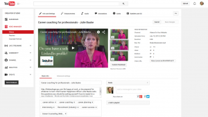
What makes someone want to watch your video? Well, there’s your stellar reputation for creating interesting content…there’s a great headline that explains what’s in it for the viewer…but even more than that is a great thumbnail. Remember this is a visual medium and you should be appealing to the eyes and emotions.
YouTube gives you a choice of three thumbnails selected from various points in your video. Or, if your channel has been verified, you can upload a custom thumbnail. I’m usually good with the ones YouTube picks for me, as you can see from the graphic above. But here are some things you should definitely watch for in choosing a thumbnail that will make viewers and web visitors want to watch what you have created:
-
1. Use close ups of faces, especially those making eye contact. Faces are compelling, but if the topic of the video is a product or other physical item, use that.
2. Strong emotions are more compelling. Show a face with a strong emotion.
3. Show the face in front of a bright colorful background. A high contract between the face and the background is best.
4. Text can work, but keep it to three or four words which do not hide the face. Keep it readable.
5. A bug or logo superimposed on the left bottom works. But keep the lower right free as YouTube often uses this area for one of their graphics.
6. Give the thumbnail an identifiable design or look any time there are a number of videos from the same producer. This reinforces the brand.
7. Design for the small screen of smart phones.
8. Keep the thumbnail simple and easy to understand.
9. Don’t mislead. A YouTube thumbnail of a bare-breasted woman not only misleads the viewer, but is also penalized as misleading.
You have great stories to share. Create great visuals, and keep them coming back for more.
–that’s a wrap